
Using Colour Psychology to Set the Mood in Bar Interiors
- gianpiciri
- Mar 28
- 4 min read
When you enter a bar, you quickly determine if the vibe matches your mood—whether it's intimate and relaxed or lively and social. This instinctive reaction is influenced by more than just the music or seating layout. Colour quietly yet significantly impacts how we perceive a space. From the subtlety of soft pastels to the vibrancy of bright primaries, the strategic use of colour psychology can turn an ordinary bar interior into an engaging environment that resonates with the emotions of its patrons. So, how can design professionals leverage the power of colour to make a lasting impression?
Understanding Colour Psychology in Hospitality Design
Colour psychology is not an enigmatic art exclusive to design experts. It is a field based on our common reactions to visual stimuli, exploring how different colors impact mood, behavior, and even appetite. In hospitality design, color significantly influences how guests feel upon entering a space. It can prompt them to relax, engage in conversations, or stay longer than they planned.
This doesn’t imply there’s a universal color scheme. A bar’s brand identity, target audience, and location all contribute to its design. A stylish cocktail lounge aimed at a cosmopolitan audience might favor modern neutrals with vibrant accents, while a laid-back beachfront bar might opt for airy blues and soft sandy tones. By understanding the psychological effects of various colors, designers can craft an environment that aligns with the brand's desired personality.
Creating Welcoming Entrances and Focal Points
When guests walk through the door, it sets the stage for their entire experience. Warm colors like burnt oranges, terracotta reds, and soft yellows often evoke feelings of comfort and friendliness. These hues can create an inviting entrance, making guests feel relaxed and open to socializing.
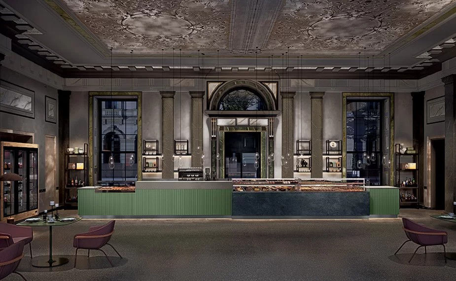
Focal points within the bar can be enlivened with striking contrasts. A textured wall in deep emerald or a sculptural installation accented with gold might capture attention, enticing guests further into the space. The key is to balance bold elements with more subtle, complementary tones. If the entrance features a dramatic burst of color, ensure the nearby seating areas have softer shades to help guests settle in comfortably without feeling overwhelmed.
Encouraging Social Interaction and Energy
Bars frequently act as social centers where friends gather, strangers meet, and memorable moments occur. Certain colors naturally enhance energy and conversation. Vibrant shades like deep reds or spicy oranges can ignite enthusiasm, encouraging guests to interact more freely with each other. These colors, when used sparingly, might be featured in communal areas such as bar counters or standing zones where patrons are likely to socialize.
A bar that changes its atmosphere throughout the day or adjusts to various events can use color strategically. During a calm afternoon, cooler tones and softer lighting might dominate, while in the evening, a slight alteration in lighting and the introduction of bolder accents can enliven the environment. This approach ensures that the color scheme remains dynamic enough to sustain interest while being cohesive enough to appear intentional.
Fostering Relaxation and Intimacy
Not all guests are looking for lively conversation. Some prefer to relax after a long day, savor a quiet drink, or enjoy a private moment. Cooler tones such as deep blues, gentle greens, or sophisticated charcoals can help create these calming spaces. These colors reduce the emotional intensity, promoting relaxation, contemplation, and perhaps more intimate interactions.
Pairing cooler hues with natural materials like timber, stone, or woven textures establishes an atmosphere that feels grounded and serene. Subtle variations in shade and saturation help delineate different zones within the bar, allowing guests to choose areas that best suit their mood. This layering of tones can provide both refuge and discovery, making the space feel richer and more nuanced over time.
Reinforcing Brand Narrative through Colour
The color scheme of a bar should never appear random. Instead, it ought to mirror its theme, location, or cultural roots. Perhaps the venue resides in a historic building, with chosen colors honoring local traditions. Alternatively, it might draw inspiration from a specific era or design movement, using shades that transport guests to a different place or time.
Consistency in furniture, fixtures, branding materials, and even uniforms strengthens the bar's narrative. A particular shade repeated in menus, signage, and upholstery can become a signature element, enhancing the memorability of the experience. Colors don't have to be static – seasonal changes or themed events might require subtle palette adjustments. This flexibility ensures the bar stays fresh and relevant.
Considering Cultural and Regional Influences
Color isn't interpreted the same way universally. Cultural subtleties can affect how certain shades are viewed. What may be soothing in one area could seem gloomy or even unwelcoming in another. Acknowledging local traditions, preferences, and symbolism when choosing color schemes can distinguish an interior that connects from one that alienates.
In a globalized market, many bars appeal to an international audience. The design might incorporate global trends while embracing locally meaningful aesthetics. A subtle reference to a specific flower’s color, cherished in local folklore, or a hue linked to the region’s natural scenery, can bridge the gap between global sophistication and local authenticity.
Discover the Difference with Italconcept design
Colour significantly impacts how guests engage with and remember a bar's interior. By thoughtfully applying colour psychology, designers and hospitality experts can craft spaces that go beyond visual appeal, transforming them into emotional settings where moods are subtly influenced and experiences are enhanced. Whether the aim is to invigorate patrons, encourage quiet contemplation, or strengthen a unique brand identity, the right colours can weave a story that remains long after the final drink is served.
If you're eager to explore how colour psychology can enhance the mood and character of your bar's interior, Carroll Design is here to assist. With our expertise in commercial bar interior design, we know how to utilize colour as a storytelling tool that complements every facet of the guest experience. Contact Italconcept Design today and let us help you create a bar environment that truly resonates – one carefully selected colour at a time.

Comments